浅谈前端为适应不同终端的布局技巧

今天关于前端布局做一个小总结,大概分为4部分,如果以后再有新想法则后补。

响应式设计

响应式布局已经是老生常谈了。为了让我们的网站在跨终端后能有着很好的前端表现,响应式可谓是功不可没。推介一篇博文《响应式那些小事》

下面是我抽取bootstrap中响应式布局代码思想写的一个小例子

demo 传送门

code

1
2
3
4
5
6
7
8
9
10
11
12
13
14
15
16
17
18
19
20
21
22
23
24
25
26
27
28
29
30
31
32
33
34
35
36
37
38
39
40
41
42
43
44
45
46
47
48
49
50
51
52
53
54
55
56
57
58
59
60
61
62
63
64
65
66
67
68
69
70
71
72
73
74
75
76
77
78
79
80
81
82
83
84
85
86
87
88
89
90
91
92
93
94
95
96
97
98
99
100
101
102
103
104
105
106
107
108
109
110
111
112
113
114
115
116
117
118
119
120
121
122
123
124
125
126
127
128
129
130
131
132
133
134
135
136
137
138
139
140
141
142
143
144
145
146
147
148
149
150
151
152
153
154
155
156
157
158
159
160
161
162
163
164
165
166
167
168
169
170
171
172
173
174
175
176
177
178
179
180
181
182
183
184
185
186
187
188
189
190
191
192
193
194
195
196
197
198
199
200
201
202
203
204
205
206
207
208
209
210
211
212
213
214
215
216
217
218
219
220
221
222
223
224
225
226
227
228
229
230
231
232
233
234
235
236
237
238
239
240
241
242
243
244
245
246
247
248
249
250
251
252
253
254
255
256
257
258
259
260
261
262
263
264
265
266
267
268
269
270
271
272
273
274
275
276
277
278
279
280
281
282
283
284
285
286
287
288
289
290
291
292
293
294
295
296
297
298
299
300
301
302
303
304
305
306
307
308
309
310
311
312
313
314
315
316
317
318
319
320
321
322
323
324
325
326
327
328
329
330
331
332
333
334
335
336
337
338
339
340
341
342
343
344
345
346
347
348
349
350
351
352
353
354
355
356
357
358
359
360
361
362
363
364
365
366
367
368
369
370
371
372
373
374
375
376
377
378
379
380
381
382
383
384
385
386
387
388
389
390
391
392
393
394
395
396
397
398
399
400
401
402
403
404
405
406
407
.container {
/*固定布局*/
width: 100%;
min-height: 1px;
margin: 0 auto;
}
.container > .row {
width: 100%;
height: 100%;
overflow: hidden;
}
.container-fluid {
/*流式布局*/
width: 100%;
min-height: 1px;
}
.container-fluid > .row {
width: 100%;
height: 100%;
overflow: hidden;
}
* {
box-sizing: border-box;
}
/*响应式*/
.container {
width: 100%;
height: 100%;
}
.container-fluid {
width: 100%;
height: 100%;
}
/*小于930px*/
@media screen and (max-width: 930px) {
.container > .row > .cls-s-1 {
width: 8.33333333%;
height: 100%;
float: left;
}
.container-fluid > .row > .cls-s-1 {
width: 8.33333333%;
height: 100%;
float: left;
}
.container > .row > .cls-s-2 {
width: 16.66666667%;
height: 100%;
float: left;
}
.container-fluid > .row > .cls-s-2 {
width: 16.66666667%;
height: 100%;
float: left;
}
.container > .row > .cls-s-3 {
width: 25%;
height: 100%;
float: left;
}
.container-fluid > .row > .cls-s-3 {
width: 25%;
height: 100%;
float: left;
}
.container > .row > .cls-s-4 {
width: 33.33333333%;
height: 100%;
float: left;
}
.container-fluid > .row > .cls-s-4 {
width: 33.33333333%;
height: 100%;
float: left;
}
.container > .row > .cls-s-5 {
width: 41.66666667%;
height: 100%;
float: left;
}
.container-fluid > .row > .cls-s-5 {
width: 41.66666667%;
height: 100%;
float: left;
}
.container > .row > .cls-s-6 {
width: 50%;
height: 100%;
float: left;
}
.container-fluid > .row > .cls-s-6 {
width: 50%;
height: 100%;
float: left;
}
.container > .row > .cls-s-7 {
width: 58.33333333%;
height: 100%;
float: left;
}
.container-fluid > .row > .cls-s-7 {
width: 58.33333333%;
height: 100%;
float: left;
}
.container > .row > .cls-s-8 {
width: 66.66666667%;
height: 100%;
float: left;
}
.container-fluid > .row > .cls-s-8 {
width: 66.66666667%;
height: 100%;
float: left;
}
.container > .row > .cls-s-9 {
width: 75%;
height: 100%;
float: left;
}
.container-fluid > .row > .cls-s-9 {
width: 75%;
height: 100%;
float: left;
}
.container > .row > .cls-s-10 {
width: 83.33333333%;
height: 100%;
float: left;
}
.container-fluid > .row > .cls-s-10 {
width: 83.33333333%;
height: 100%;
float: left;
}
.container > .row > .cls-s-11 {
width: 91.66666667%;
height: 100%;
float: left;
}
.container-fluid > .row > .cls-s-11 {
width: 91.66666667%;
height: 100%;
float: left;
}
.container > .row > .cls-s-12 {
width: 100%;
height: 100%;
float: left;
}
.container-fluid > .row > .cls-s-12 {
width: 100%;
height: 100%;
float: left;
}
}
/*介于930px到1024px之间*/
@media screen and (min-width: 930px) {
.container > .row > .cls-m-1 {
width: 8.33333333%;
height: 100%;
float: left;
}
.container-fluid > .row > .cls-m-1 {
width: 8.33333333%;
height: 100%;
float: left;
}
.container > .row > .cls-m-2 {
width: 16.66666667%;
height: 100%;
float: left;
}
.container-fluid > .row > .cls-m-2 {
width: 16.66666667%;
height: 100%;
float: left;
}
.container > .row > .cls-m-3 {
width: 25%;
height: 100%;
float: left;
}
.container-fluid > .row > .cls-m-3 {
width: 25%;
height: 100%;
float: left;
}
.container > .row > .cls-m-4 {
width: 33.33333333%;
height: 100%;
float: left;
}
.container-fluid > .row > .cls-m-4 {
width: 33.33333333%;
height: 100%;
float: left;
}
.container > .row > .cls-m-5 {
width: 41.66666667%;
height: 100%;
float: left;
}
.container-fluid > .row > .cls-m-5 {
width: 41.66666667%;
height: 100%;
float: left;
}
.container > .row > .cls-m-6 {
width: 50%;
height: 100%;
float: left;
}
.container-fluid > .row > .cls-m-6 {
width: 50%;
height: 100%;
float: left;
}
.container > .row > .cls-m-7 {
width: 58.33333333%;
height: 100%;
float: left;
}
.container-fluid > .row > .cls-m-7 {
width: 58.33333333%;
height: 100%;
float: left;
}
.container > .row > .cls-m-8 {
width: 66.66666667%;
height: 100%;
float: left;
}
.container-fluid > .row > .cls-m-8 {
width: 66.66666667%;
height: 100%;
float: left;
}
.container > .row > .cls-m-9 {
width: 75%;
height: 100%;
float: left;
}
.container-fluid > .row > .cls-m-9 {
width: 75%;
height: 100%;
float: left;
}
.container > .row > .cls-m-10 {
width: 83.33333333%;
height: 100%;
float: left;
}
.container-fluid > .row > .cls-m-10 {
width: 83.33333333%;
height: 100%;
float: left;
}
.container > .row > .cls-m-11 {
width: 91.66666667%;
height: 100%;
float: left;
}
.container-fluid > .row > .cls-m-11 {
width: 91.66666667%;
height: 100%;
float: left;
}
.container > .row > .cls-m-12 {
width: 100%;
height: 100%;
float: left;
}
.container-fluid > .row > .cls-m-12 {
width: 100%;
height: 100%;
float: left;
}
}
/*大于1024px*/
@media screen and (min-width: 1240px) {
.container {
min-width: 1240px;
height: 100%;
border: none;
}
.container > .row > .cls-l-1 {
width: 8.33333333%;
height: 100%;
float: left;
}
.container-fluid > .row > .cls-l-1 {
width: 8.33333333%;
height: 100%;
float: left;
}
.container > .row > .cls-l-2 {
width: 16.66666667%;
height: 100%;
float: left;
}
.container-fluid > .row > .cls-l-2 {
width: 16.66666667%;
height: 100%;
float: left;
}
.container > .row > .cls-l-3 {
width: 25%;
height: 100%;
float: left;
}
.container-fluid > .row > .cls-l-3 {
width: 25%;
height: 100%;
float: left;
}
.container > .row > .cls-l-4 {
width: 33.33333333%;
height: 100%;
float: left;
}
.container-fluid > .row > .cls-l-4 {
width: 33.33333333%;
height: 100%;
float: left;
}
.container > .row > .cls-l-5 {
width: 41.66666667%;
height: 100%;
float: left;
}
.container-fluid > .row > .cls-l-5 {
width: 41.66666667%;
height: 100%;
float: left;
}
.container > .row > .cls-l-6 {
width: 50%;
height: 100%;
float: left;
}
.container-fluid > .row > .cls-l-6 {
width: 50%;
height: 100%;
float: left;
}
.container > .row > .cls-l-7 {
width: 58.33333333%;
height: 100%;
float: left;
}
.container-fluid > .row > .cls-l-7 {
width: 58.33333333%;
height: 100%;
float: left;
}
.container > .row > .cls-l-8 {
width: 66.66666667%;
height: 100%;
float: left;
}
.container-fluid > .row > .cls-l-8 {
width: 66.66666667%;
height: 100%;
float: left;
}
.container > .row > .cls-l-9 {
width: 75%;
height: 100%;
float: left;
}
.container-fluid > .row > .cls-l-9 {
width: 75%;
height: 100%;
float: left;
}
.container > .row > .cls-l-10 {
width: 83.33333333%;
height: 100%;
float: left;
}
.container-fluid > .row > .cls-l-10 {
width: 83.33333333%;
height: 100%;
float: left;
}
.container > .row > .cls-l-11 {
width: 91.66666667%;
height: 100%;
float: left;
}
.container-fluid > .row > .cls-l-11 {
width: 91.66666667%;
height: 100%;
float: left;
}
.container > .row > .cls-l-12 {
width: 100%;
height: 100%;
float: left;
}
.container-fluid > .row > .cls-l-12 {
width: 100%;
height: 100%;
float: left;
}
}

响应式可以非常灵活的应用,但也要注意其不常用设备信息的兼容问题。

自适应设计

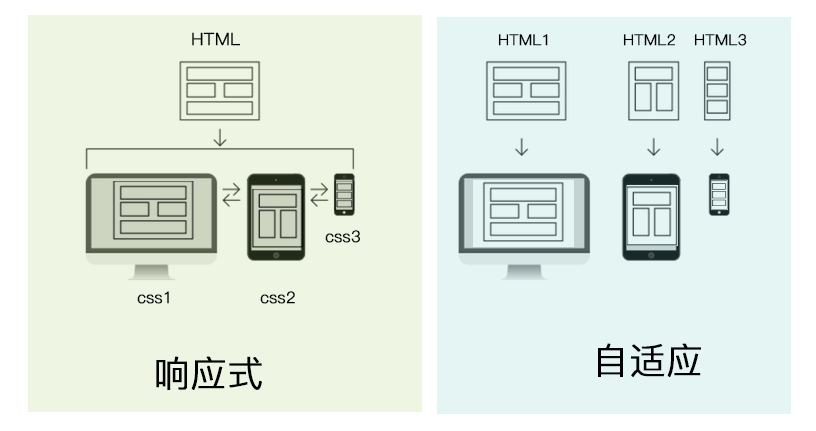
说到自适应设计(AWD:Adaptive Design )就不得不将它与响应式设计(RWD:Ethan Marcote)进行一番对比。

区别:

RWD :通过Media Query对一整套前端页面在不同端所需表现进行控制。
AWD:针对于不同终端制定不同的前端页面,服务器会根据浏览器访问网站时所带终端信息进行判断并返回相应页面。

优势比较:

优势:

AWD可以针对于不同终端深度自定义网页及交互;
RWD将一套html+css代码适应与多终端;

劣势:

AWD需开发多套html+css,并且需要大体统计客户所使用的终端情况,以便更有针对性;
RWD中css代码冗余太多,会造成加载负担;

有图有真相:

至于网站需要选择哪种布局设计需要看个人公司工期安排。

栅格化布局(display)

先说一个场景很多时候我们想做一个元素不定的横向导航,希望nav标签内的元素动态平分父元素的width,不用js脚本的话我们就可以尝试接下来的方法。

display table

将元素扮演为表格,此方法与table标签有异曲同工之妙,不同的是在语义化方面无法表现出像table一样的数据包装。IE8之后无需担心兼容性问题。

table
使该元素按table样式渲染
table-row
使该元素按tr样式渲染
table-cell
使该元素按td样式渲染
table-row-group
使该元素按tbody样式渲染
table-header-group
使该元素按thead样式渲染
table-footer-group
使该元素按tfoot样式渲染
table-caption
使该元素按caption样式渲染
table-column
使该元素按col样式渲染
table-column-group
使该元素按colgroup样式渲染

Demo Code

1
2
3
4
5
6
7
8
9
10
11
12
13
14
15
16
17
<style>
#main {
display: table;
border-collapse: collapse;
width: 100%;
}
#main>div{
display: table-cell;
border-left:5px solid #e47f17;
text-indent: 2em;
}
</style>
<div id="main">
<div>? navigation column content…</div>
<div>? news headlines column content…</div>
<div>? main article content…</div>
</div>

column 布局

CSS3中提出多列布局(multi-column),补充了传统HTML网页中块状布局模式。非常适合宽屏终端排版。
Demo Code:

1
2
3
4
5
6
7
8
9
10
11
12
13
14
15
16
<style>
.columsBox {
-moz-column-count: 3;
-webkit-column-count: 3;
column-count: 3;
-moz-column-gap: 40px;
-webkit-column-gap: 40px;
column-gap: 40px;
-moz-column-rule: 4px solid #f9ae27;
-webkit-column-rule: 4px solid #f9ae27;
column-rule: 4px solid #f9ae27;
}
</style>
<div class="columsBox">
Internet Explorer 不支持 column-count 属性。column-count和column-gap可以简写为columns:column-count column-gap。巧妙的运用column能够完成web开发中的很多场景,如要求不高的瀑布流,杂志图文排版等等。
</div>

flexbox (弹性布局)

请移步《FLEXBOX(弹性布局)》

布局中特殊单位的灵活应用

请移步《布局中长度单位的灵活应用》

原文=> http://blog.thephenix.com/2018/05/26/LayoutSkill/ 【请尊重版权】